Duolingo look sick, one of the most popular language learning apps today, has a mascot that many users recognize instantly: Duo the Owl. This cute, green, and slightly quirky owl has become the face of Duolingo, a symbol of the app’s lighthearted and gamified approach to learning new languages. But recently, something about Duo has changed.
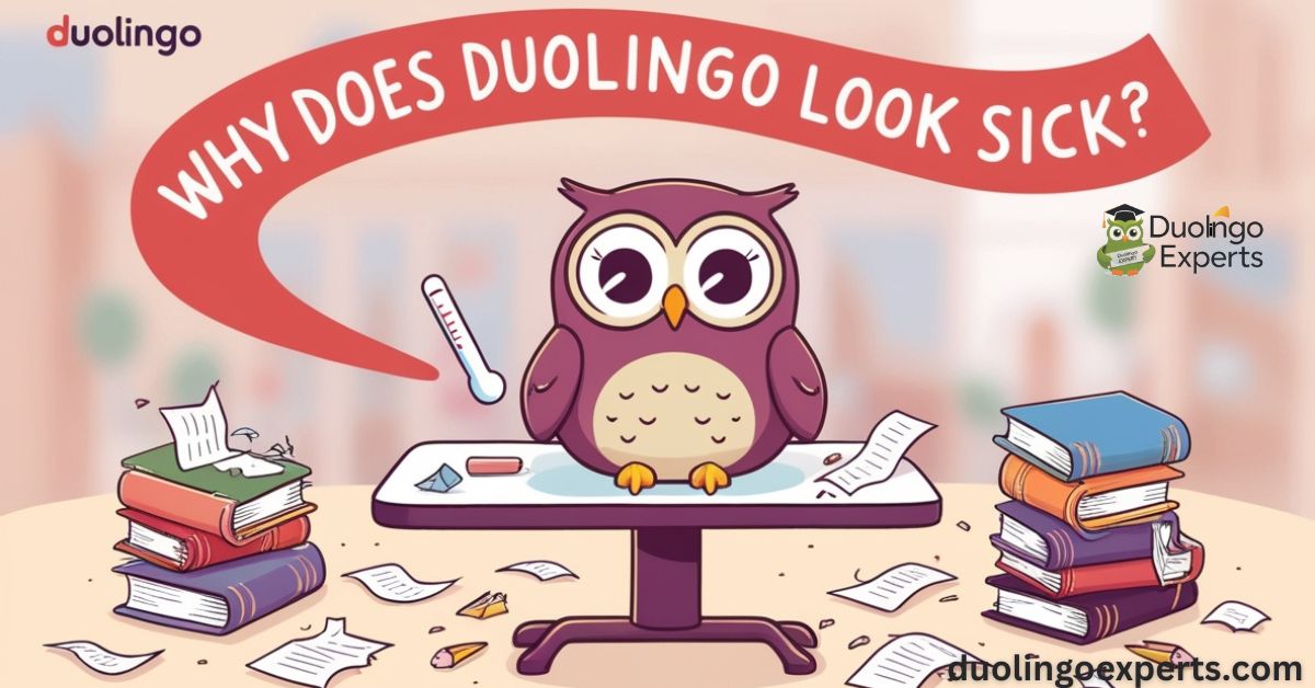
The once-friendly, energetic owl now appears sick—with a droopy eye, flushed face, and a dripping nose. It’s enough to leave users wondering, “Why does Duolingo look sick?”The transformation of Duo into a sickly version with a “bird flu” theme has sparked curiosity, confusion, and even amusement across social media.
But this design change is more than just a random alteration. It’s part of a larger marketing strategy that plays on the emotional connection users have with the app and its mascot. In this blog post, we will explore the backstory behind this bizarre change, the psychological reasons behind it, and the marketing impact it has had on Duolingo’s brand.
Duo the Owl: More Than Just an Icon
The Origins of Duo the Owl
To understand why Duolingo’s owl mascot has evolved in this way, let’s first take a look at Duo the Owl’s origins. Launched in 2011, Duolingo sought to create a language learning platform that was both effective and enjoyable. The app wanted to make language learning accessible to all, breaking down barriers with its fun, interactive approach.
The choice of an owl for the mascot was no accident. Owls have long been associated with wisdom and knowledge, which made them the perfect symbol for a language learning app. The green color was chosen because it’s vibrant and inviting, drawing users in with its freshness. Duo was designed to be cute and approachable—nothing too intimidating, just a friendly guide to your language-learning journey.
Over time, Duo the Owl became synonymous with Duolingo’s playful, gamified approach to learning. With constant reminders to “practice” and “keep your streak going,” Duo’s wide-eyed enthusiasm made users feel like they weren’t just studying but having fun. This mascot was a key element in Duolingo’s overall branding strategy, helping the app stand out in a crowded market of language learning apps.
The New Look: Duo the Sick Owl
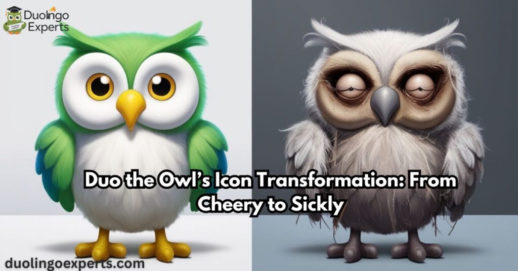
But lately, something’s changed. Users who open their Duolingo app have been greeted by an owl that’s, well, not looking too great. This sick version of Duo is a departure from the usual energetic mascot. Instead of a bright, cheerful expression, the owl now looks exhausted, with a drooping eye, sweat on its face, and a visibly runny nose.
The sick look has been described as both humorous and unsettling. It’s meant to mimic the feeling of being under the weather, particularly during cold and flu season. The theme ties in with the idea that staying healthy is important, just as maintaining consistency in your language learning is. Duo’s sick appearance seems to serve as a lighthearted reminder to not let your streaks slip—just as you wouldn’t let your health deteriorate without addressing it.
At first glance, it may seem like an odd choice for an app designed to help people learn languages. After all, Duolingo is a fun, upbeat experience that encourages daily practice. So, why would the app take a playful approach to sickness? The answer lies in the psychological and marketing strategy behind the design change.
The Marketing Behind the Sick Duo
Humor as a Tool for Engagement
Humor is one of Duolingo’s most powerful marketing tools. From playful notifications about losing streaks to the humorous voiceovers in its lessons, Duolingo uses comedic elements to keep users engaged and entertained. The sick version of Duo fits neatly into this strategy. By taking something as universally relatable as sickness and adding a quirky, humorous twist, Duolingo is tapping into the power of curiosity-driven engagement.
The sick Duo is designed to provoke a reaction, whether it’s laughter, surprise, or mild disgust. This reaction is exactly what Duolingo wants. In today’s competitive app market, it’s not enough for an app to just be functional—it needs to be engaging, memorable, and shareable. By introducing a sick Duo, Duolingo has created something that’s meme-worthy and social media-friendly.
In fact, the sick Duo version of the app quickly became a trending topic across social media platforms like Twitter, Instagram, and Reddit. Users posted memes, jokes, and comments about Duo’s sick appearance, fueling a buzz that ultimately benefitted Duolingo’s brand visibility. This is a classic example of how creative marketing and viral trends can be leveraged to boost engagement and increase downloads.
Symbolism and User Engagement
One of Duolingo’s key tactics has always been to make users feel personally connected to the app. Duo’s friendly face has long served as a guide to users on their language-learning journey. But the sick version of Duo goes a step further by tapping into an emotional connection.
Psychologically, users may feel more inclined to help the sick Duo, just as they might feel a sense of responsibility to take care of a friend or loved one who’s under the weather. In the context of language learning, this connection could inspire users to stay consistent and avoid letting their streaks “sickly” slip. It’s a subtle but effective way to increase user retention and encourage continued use of the app.
Duolingo Social Media Buzz and Meme Culture
The sick Duo icon became an instant meme, which only served to increase Duolingo’s visibility. Meme culture is a powerful force in digital marketing today. It creates viral, user-generated content that spreads rapidly across the internet. By introducing a quirky, attention-grabbing change to the app’s icon, Duolingo effectively positioned itself to capitalize on this cultural trend.

The sick version of Duo made waves on social media, with users on TikTok, Instagram, and Reddit all commenting on how strange or funny the icon looked. Some even made their own memes and jokes about Duo’s new appearance, continuing the conversation and pushing Duolingo into the spotlight. The combination of humor, surprise, and relatability ensured that Duolingo’s app remained top of mind for a large number of people.
The Impact on App Downloads and Engagement
It’s clear that Duolingo’s sick icon isn’t just a fun gimmick; it’s part of a broader marketing strategy to increase user engagement and app downloads. By generating social media buzz around this unexpected change, Duolingo has managed to draw attention to itself, even among users who might not have interacted with the app in a while.
This kind of viral marketing is extremely effective. Not only does it boost brand awareness, but it also has a direct impact on user retention. The sick Duo icon serves as a subtle, yet constant reminder to users that their language learning journey requires consistency. Just like staying healthy, language practice needs daily attention. And Duolingo is using humor and creative icon transformations to ensure users remain engaged.
The Emotional Bond Between Duo and Duolingo Users
The Role of Emotional Connection in Branding
Why do we care so much about a cartoon owl looking sick? The answer lies in the emotional bond that users have formed with Duo the Owl over the years. Duo is more than just a character in an app—he’s a brand persona that many users have come to trust and rely on. This bond is integral to Duolingo’s ability to keep users engaged and returning every day.
The idea of emotional connection with mascots has been well documented in branding and marketing studies. Mascots, like Duo, are designed to elicit emotional responses from consumers, whether it’s joy, affection, or even empathy. By infusing Duo with human-like characteristics—such as getting sick—the app creates a more relatable experience for users.
For Duolingo, this connection is crucial. Users aren’t just interacting with an educational app—they’re interacting with a character that feels like a companion on their journey. When Duo appears sick, users may feel the urge to help him recover by continuing their language lessons, which in turn benefits Duolingo’s business model by increasing engagement and retention.
The Importance of Consistency and Engagement
Duo’s sick appearance is also a clever reminder about the importance of streaks—Duolingo’s gamification element that encourages users to practice every day. Streaks are a key part of the app’s design strategy, creating a sense of accomplishment and motivating users to maintain their daily language practice.
The sick Duo icon plays into this by showing what happens when you neglect your streak. If you stop practicing, your streak will suffer—just like how Duo’s health seems to deteriorate when users don’t stay on top of their learning. It’s a playful, yet effective, way of encouraging users to keep coming back day after day.
Duo the Owl’s Icon Transformation: From Cheery to Sickly

A Look at Previous Icon Changes
Duolingo’s mascot has undergone multiple icon transformations over the years, and the sick Duo version is far from the first time the app has played with its branding. Each change has been carefully crafted to reflect Duolingo’s evolving marketing strategies and goals, which often include keeping the experience fresh and engaging for users.
For instance, in the past, Duo has been seen with a variety of expressions, all designed to elicit specific emotional responses from users. Some versions included:
- Duo on fire – A dramatic, fiery-eyed Duo symbolized excitement and urgency, creating a sense of intensity and push to meet goals.
- Duo melting – A version where the owl seemed to “melt” under pressure, playing on the idea that users could feel the heat to keep up with their lessons.
- Duo looking worried – At times, Duo was portrayed looking concerned, emphasizing the importance of practice and the consequences of missing lessons.
Each of these transformations, including the sick Duo, plays into Duolingo’s larger strategy of user engagement. They’re not just random changes—they’re designed to keep the app visually dynamic and ensure that users feel connected to the mascot and the learning process. Each time Duo’s look evolves, it draws attention, encourages users to talk about it, and ultimately keeps them invested in the app.
The Power of Icon Customization
In addition to transforming Duo’s look to keep things fresh, Duolingo also gives users the ability to customize the app’s icon, making the experience even more personal. Icon customization is a feature available to premium users, such as those subscribed to Super Duolingo or Duolingo Max, and it plays a big role in maintaining a strong connection between users and the app.
Customization options include:
- Premium Icons: Super Duolingo and Duolingo Max users can unlock special icons for the app, making their version of Duo even more personalized. This offers a sense of exclusivity and adds an extra layer of value to premium subscriptions.
- Streak Society Icons: For those who have reached impressive streak milestones, Duolingo offers special icons as rewards. These symbols help mark achievements and celebrate users’ consistency in their language learning journey.
By offering app icon customization, Duolingo taps into the growing trend of personalization in app design. Users feel more connected to the app when they can reflect their progress and achievements in the app’s appearance. Moreover, it reinforces the sense of accomplishment that Duolingo is all about. After all, users don’t just want to learn a language—they want to feel good about their progress, and seeing their custom Duo icon as a symbol of their efforts can be very rewarding.
The Evolution of Duo’s Visual Identity
Duolingo has put significant effort into shaping its visual identity over the years. As one of the most recognizable brands in the language learning space, Duolingo has made sure its look is instantly identifiable. Duo’s character design and the color scheme have always been important aspects of the app’s success. However, the mascot’s look has evolved over time, reflecting broader shifts in the brand’s strategy.
The Green Owl and Its Symbolism
The green owl has always symbolized knowledge, wisdom, and learning, which are key values for Duolingo. The color green is often associated with growth, freshness, and positivity—qualities Duolingo wanted to convey to users who were embarking on their language learning journey. These elements have always been central to Duolingo’s brand, but the introduction of the sick Duo icon shows that Duolingo is not afraid to challenge users’ expectations and shake things up.
The sick Duo icon, while temporarily unsettling, serves as a reminder to stay consistent with your lessons. It introduces an element of surprise and humor, keeping the app from becoming too predictable. Duolingo’s ability to shift its visual identity, and sometimes disrupt it for strategic reasons, helps maintain user curiosity and excitement.
Why Duo Looks Sick Now
The decision to introduce the sick Duo mascot was undoubtedly a strategic marketing move. It taps into several psychological and emotional triggers, encouraging users to stay on track with their learning while also enhancing the app’s brand persona. The key reasons behind Duo’s new sick look include:
- Creating curiosity: The sick Duo is visually striking and begs the question, “Why does Duo look sick?” This curiosity drives engagement, as users flock to social media to discuss the new look, increasing visibility for Duolingo.
- Boosting motivation: By showing the consequences of neglecting your learning (symbolized by Duo’s sickness), the icon encourages users to stay engaged and consistent. It’s a lighthearted way to remind users not to skip their lessons and maintain their streaks.
- Leveraging meme culture: The sick Duo quickly became a meme sensation. Memes are a powerful tool in marketing today, as they foster organic user engagement and encourage viral content. By introducing something so unusual and eye-catching, Duolingo ensured that the sick Duo would be talked about and shared across social media, expanding the app’s digital footprint.
Duo’s Emotional Connection With Users
Duolingo’s ability to forge an emotional connection with users through its mascot is one of the reasons the app has achieved such success. Duo is more than just a logo—it’s a guide and a companion on your language learning journey. That emotional bond is key to the app’s retention strategy. When Duo looks sick, users may feel a sense of responsibility to help the mascot recover, motivating them to continue their lessons.

This emotional connection is enhanced by Duolingo’s use of gamification. Duo isn’t just an inanimate symbol; he’s a character with needs and goals, just like the user. When users see Duo’s sickly appearance, they’re subconsciously reminded of the importance of daily practice, helping to reinforce the habit of returning to the app day after day. By personifying Duo and giving him health problems, Duolingo adds a layer of relatability to the process of learning a language.
Social Media Buzz: How the Sick Duo Became a Trend
One of the most significant impacts of Duo’s sick appearance has been the viral social media buzz it has generated. The change to Duo’s design wasn’t just a cosmetic shift; it was a digital marketing tactic that successfully sparked conversations online. Users flooded platforms like Twitter, Instagram, and Reddit to share their thoughts on the new icon, discuss the “bird flu” theme, and create memes.
This kind of user-generated content is invaluable in marketing today. By introducing a distinctive and memorable mascot transformation, Duolingo encouraged people to talk about the app in a fun, casual way. It wasn’t just the app’s social media accounts pushing content; it was users themselves creating the buzz. This organic, viral marketing helped Duolingo reach even more people who might not have been previously engaged with the app.
On TikTok, users created short, humorous videos about the sick Duo icon, sometimes even creating skits where Duo would “recover” after users completed their lessons. The sick Duo became a cultural symbol, not just for Duolingo, but for the broader language learning community. It was a perfect example of how Duolingo used visual identity and memes to turn something as simple as a character redesign into a marketing goldmine.
Key Marketing Insights from the Sick Duo Campaign
The sick Duo icon is a perfect example of Duolingo’s strategic approach to user engagement and marketing. Here are a few key insights from this campaign:
- Emotional engagement is key: Duo’s emotional connection with users, whether it’s through humor, empathy, or the sense of responsibility to keep him healthy, drives user retention and engagement.
- Icon changes keep things fresh: Regular updates to Duo’s design help keep the app’s visual identity dynamic and engaging, ensuring users don’t get bored.
- Social media can drive viral marketing: By creating something visually striking and unusual, Duolingo ensured that users would talk about the app, driving organic buzz.
- Gamification drives consistency: Duo’s sick appearance is a clever reminder to maintain consistency in learning, a key principle of Duolingo’s gamification strategy.
Frequently Asked Questions
Why does the Duolingo icon look weird?
The Duolingo icon looks weird to catch users’ attention and create curiosity. This playful change encourages engagement and reminds users to stay consistent with their learning.
Why does my Duolingo look like it’s melting?
Your Duolingo icon might look like it’s melting as part of a playful design change aimed at grabbing attention and adding humor. It’s a creative way to remind users to stay consistent with their language learning while engaging them visually.
Who is the villain in Duolingo?
The villain in Duolingo is often portrayed as Duo the Owl’s “evil” counterpart—the “Streak Freeze” character. This character symbolizes the potential loss of streaks, motivating users to stay consistent with their lessons.
Is Duolingo shutting down in 2024?
No, Duolingo is not shutting down in 2024. The app continues to grow, offering new features and expanding its user base globally.
Why does my Duolingo look sad?
Your Duolingo icon may look sad to remind you to keep up with your lessons and not break your streak. It’s a playful, emotional design change aimed at encouraging consistency in your language learning.
Why do I lose hearts on Duolingo?
You lose hearts on Duolingo when you make mistakes during lessons, which serves as a way to encourage improvement. It adds a level of challenge, motivating you to stay focused and complete exercises without errors.
Are there mistakes in Duolingo?
Yes, Duolingo can have mistakes in its translations or exercises, as it relies on user-generated content and automated systems. However, the app continuously works on improving accuracy through updates and user feedback.
Does Duolingo have inappropriate content?
Duolingo strives to maintain appropriate content, but occasional errors may occur. The app works to quickly remove any inappropriate material to ensure a safe learning environment.
Why does my Duolingo app look ill?
Your Duolingo app may look ill as part of a playful design change to encourage user engagement and remind you to stay consistent with lessons. It’s a fun, attention-grabbing tactic to motivate continued learning.
Conclusion
Duolingo’s decision to introduce the sick Duo icon was more than just a playful change—it was a strategic move designed to engage users, spark social media conversations, and reinforce the importance of consistency in language learning. By leveraging humor, visual identity, and emotional engagement, Duolingo has shown just how effective creative branding can be.
So, the next time you see the sick Duo owl, remember that it’s not just a flu-ridden mascot. It’s a reminder to stay on track with your language lessons, continue building your streak, and keep having fun with your language learning journey. After all, learning a new language is all about consistency—and Duo’s health is a constant reminder to stick with it!
- Read Also:
- Cost of Super Duolingo: Is It Worth It?
- Who Holds the Longest Duolingo Streak? Meet the Record Breaking Language Champions!
- How Many Sections in Duolingo Spanish: Discover the Truth Here!

DuolingoExperts, managed by MarkJohan, offers expert insights and tips for mastering languages. A tech-driven platform to enhance your learning experience.

