Duolingo, the world’s most celebrated language learning app, is known for its innovative approach to education and its iconic mascot, Duo—the green owl. Since its debut, Duo has become a symbol of fun, motivation, and persistence in the world of online learning. However, as the mascot evolved, users began to notice changes in its design, leading to perceptions of the Duolingo app icon being “old.”
This article unravels the story behind Duo’s evolution, its role in shaping brand identity, and the driving forces behind icon transformations. Dive deep into the original design, its strategic evolution, and the response from millions of loyal users.
Key Takeaways
- The green owl mascot Duo embodies wisdom and fun, representing the heart of Duolingo’s visual identity.
- Duo’s design has evolved significantly, balancing modern trends with nostalgia.
- User perceptions, memes, and social media engagement play a crucial role in shaping the icon’s journey.
- Customization options, offered to premium subscribers, allow greater personalization of the app experience.
- Design updates and strategies reflect Duolingo’s focus on maintaining user engagement and increasing brand loyalty.
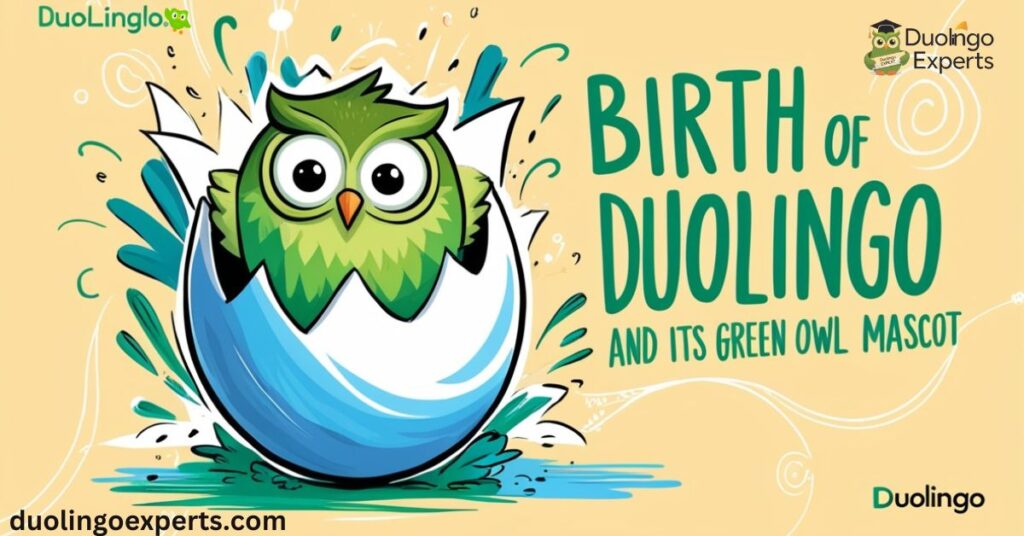
The Birth of Duolingo and Its Green Owl Mascot

Origins of Duolingo
Duolingo was launched in 2011 by Luis von Ahn and Severin Hacker with a mission to make language learning free and accessible to everyone. The platform quickly gained popularity, revolutionizing the way people learn new languages through gamified lessons, streak rewards, and interactive exercises.
Central to Duolingo’s success was its ability to stand out in an already crowded market. This is where Duo, the green owl mascot, became a game-changer.
Why an Owl?
The founders wanted a character that embodied learning and wisdom. Owls, often associated with knowledge in folklore, were the perfect choice. However, instead of opting for a solemn or serious design, Duolingo’s team envisioned an approachable, playful mascot that would appeal to learners of all ages.
“We wanted Duo to feel like a friend, not a teacher—someone who motivates you with encouragement rather than judgment.” – Duolingo Design Team
The Original Design
The original Duo design was a flat, minimalistic owl with bright green feathers and big, expressive eyes. Key features included:
- Bright Colors: The green was chosen for visibility and uniqueness.
- Geometric Shapes: Simplistic yet engaging, reflecting the brand’s modern, innovative approach.
- Playful Expressions: Duo’s wide eyes and friendly smile made it instantly likable.
This minimalist design helped Duolingo establish its visual identity, creating strong brand recognition in the early days of the app.
The Evolution of Duolingo’s Green Owl
Why Duo Needed to Evolve
As Duolingo grew, so did its user base, crossing over 103.6 million monthly active users by 2024. To keep up with modern design trends and user expectations, the mascot underwent periodic updates.
Key reasons behind these transformations included:
- Adapting to Design Trends: Moving from flat to dynamic designs to match evolving aesthetics.
- Enhancing Brand Appeal: Keeping Duo fresh and engaging for both new and returning users.
- Boosting User Interaction: Using visual cues to celebrate streaks and motivate learners.
Timeline of Icon Transformations
| Year | Design Update | Key Features |
|---|---|---|
| 2011 | Original minimalist Duo | Flat, geometric shapes, and bright green. |
| 2014 | Slight refinement | Sharper outlines and improved proportions. |
| 2018 | Major revamp | Softer edges, expressive animations, 3D elements. |
| 2022 | Enhanced modern Duo | Dynamic poses, meme-worthy reactions, and AR features. |
Memorable Design Variations
Over the years, Duo’s design has seen some quirky, temporary updates:
- The Melting Owl Design: Introduced humorously during April Fool’s events, it became a viral sensation.
- Orange Duo with Flaming Eyes: A playful nod to streak reminders, where Duo becomes intense to motivate users.
These temporary design variations created buzz on social media platforms, further cementing Duo’s status as an internet icon.
Why Is Duolingo Icon Perceived as ‘Old’?
1. Nostalgia Among Users
For early adopters, the original Duo design holds a sentimental value. It’s a reminder of their first steps in language learning, making newer iterations feel less authentic.
“I miss the old Duo! It felt more personal and less like a corporate mascot.” – User on Instagram
2. Design Fatigue
Despite regular updates, frequent exposure to the mascot leads to design fatigue—a phenomenon where users start viewing even fresh designs as outdated.
3. Memes and Social Media Impact
Memes like the “Sad, Old Duo Icon” or the Melting Owl design have influenced how users perceive the mascot. While intended as humorous, these interpretations often exaggerate the idea of an “old” icon.
The Role of Social Media and User Reactions
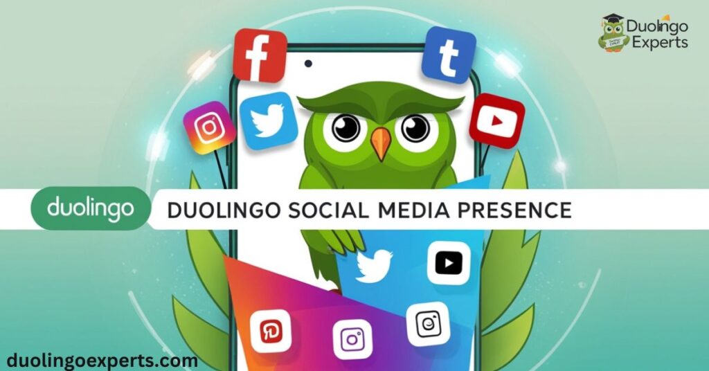
Duolingo’s Social Media Presence

Duolingo is a master at leveraging social media engagement to promote its brand. Its witty posts, memes, and interactive challenges have made Duo a viral sensation.
- 13.4 million TikTok followers
- 3.3 million Instagram followers
Duo’s playful personality shines on these platforms, often teasing users about streaks or sharing hilarious reminders to practice.
Community Feedback and Impact
Community feedback is a cornerstone of Duolingo’s branding strategies. The app actively listens to user opinions to refine its designs and features. For example:
- The shift to more expressive animations came after users requested a livelier mascot.
- Customization options for icons were introduced to cater to diverse preferences among premium subscribers.
Customization Options for Premium Subscribers
Features for Super Duolingo Users
Subscribers to Super Duolingo and Duolingo Max enjoy exclusive benefits, including:
- Customizable App Icons: Options to choose special designs for Duo.
- Streak Society Features: Celebrations and rewards for maintaining long streaks.
- Special Edition Icons: Seasonal or event-based icons available only to premium users.
These features not only enhance the user experience but also build brand loyalty among dedicated learners.
Strategic Design Changes: A Marketing Move
Event-Based Updates
One of Duolingo’s most effective marketing strategies is the use of event-based design updates. These temporary changes—like the Melting Owl design—create a sense of novelty and encourage users to interact more with the app.
The Psychology of Design
Duolingo’s designers use psychology-driven tactics to boost engagement:
- Visual Cues: Duo’s expressive reactions reinforce positive behaviors.
- Novelty Effect: Introducing new icons or designs keeps users curious and motivated.
- Emotional Connection: Duo’s relatable expressions make learners feel supported.
Future Trends in Duolingo’s Visual Identity

AR and Dynamic Mascots
As augmented reality becomes more mainstream, we might see Duo integrating AR features to create a more immersive learning experience. Imagine Duo popping up in real-time to celebrate milestones or correct mistakes!
Balancing Innovation with Tradition
While innovation is important, maintaining a consistent visual identity ensures users continue to recognize and trust the Duolingo brand.
FAQs
Why is Duolingo’s mascot perceived as old?
Duolingo’s mascot, Duo, is perceived as “old” due to nostalgia tied to its classic design. Recent updates, such as the Melting Owl, contrast sharply with its original look, amplifying this perception among users.
What are some recent icon transformations?
Recent icon transformations include the playful Melting Owl, the dramatic Orange Duo with flaming eyes, and limited-edition icons for events. These updates reflect event-based designs and user engagement tactics.
Does Duolingo offer customization options?
Yes, Duolingo offers customizable icons for users, allowing them to choose different designs for their app. Premium subscribers enjoy exclusive icons, like Super Duolingo or Streak Society designs, enhancing personalization.
How does community feedback influence design changes?
Community feedback plays a key role in shaping Duolingo’s design changes by highlighting user preferences and reactions. Social media trends, memes, and app reviews guide updates, ensuring designs stay engaging and relevant.
What’s next for Duo’s design?
The next phase for Duo’s design could include more interactive features and seasonal updates to keep the mascot fresh. Augmented reality (AR) elements might also be integrated for a more immersive user experience.
How many people use Duolingo daily and monthly?
As of 2024, Duolingo boasts 37 million daily active users and 103.6 million monthly active users, making it one of the most popular language learning apps globally.
What is the purpose of temporary design variations like the Melting Owl icon?
Temporary designs, like the Melting Owl, are part of event-based design updates. These changes spark user curiosity, create social media buzz, and encourage more app engagement by adding a sense of fun and novelty.
Why does Duolingo focus on mascot evolution and icon updates?
Updates to Duo’s design are part of Duolingo’s broader branding strategies to keep the app visually appealing, increase user engagement, and adapt to evolving design trends.
What role does social media play in shaping Duolingo’s design decisions?
Social media provides direct insights into user reactions, trends, and preferences. Memes, comments, and feedback from platforms like TikTok and Instagram help Duolingo refine its branding and update its mascot or features accordingly.
Can users suggest new icon designs or changes?
Duolingo values user feedback through surveys, social media, and community forums. While there isn’t a formal option for users to submit designs, feedback heavily influences features like customizable app icons and Streak Society rewards.
Conclusion
The story of Duolingo’s green owl mascot, Duo, is a testament to the power of design in creating an engaging and memorable brand. From its original minimalist design to its current dynamic persona, Duo has evolved to meet the needs of millions of learners worldwide.
As Duolingo continues to innovate, its commitment to balancing tradition with modernity will ensure Duo remains an iconic symbol in the world of language learning apps. Whether you love the Melting Owl design or prefer the classic green Duo, one thing is clear: Duo isn’t just a mascot—it’s a motivator, a meme, and a beloved companion in the journey of learning.
>>>Read Also: How to Duolingo Log In and Start Your Language Journey Today?

DuolingoExperts, managed by MarkJohan, offers expert insights and tips for mastering languages. A tech-driven platform to enhance your learning experience.
